Wednesday, 30 April 2014

Shirley Nette Williams

I have decided to look into works by Shirley Nette Williams an artist who creates her own unique style through multimedia portraits and landscapes linking how the clothes we wear effect our persona and the emotional connection between use and clothes. Williams uses her bare hands and/or sewing machine to stitch images of intriguing faces/landscapes.  In the process she experiments with various mixed media forms such as fabric dyes, acrylic paint, plastic mesh and even teabags, reusing and up-cycling whatever she can find.  The result is an intricately layered piece of art that amazes with its detail and provokes curiosity and fascination with the form, lines, colour, shape, technique and her talent of working with so many materials.
http://shirleynettewilliams.com/
Here you can see one of Shirley's landscape creations, I chose to look into and analyse this piece as Shirley normally tends to stick with portraits but in this instance she adapts her skills and techniques to produce a beautiful landscape observation using a range of mixed media's such as, stitch, dye, clothing. I particularly love the use of minimal colour and the abstract sense of scale and proportion with the multitude of straight, curved and sketched lines.
This piece has a very cold feel to me mainly due to the sombre pale dirty blues and white tones, also giving the piece a very wintry feel.
Over all I love the vintage reworked aesthetic this piece emits with its thick stitches and fine machine stitches, but also down to the sketchy cross hatched effect running up one side of the piece adding a layered translucent look.
new face-2This is my favourite portrait by Shirley Nette Williams from her new series of portraits "cut from the same cloth" I particularly liked this piece for the precision Shirley has achieved by using a sewing machine and threading lines to create this very delicate continuous lined drawing which is something I could take forward in developing my observations from YSP and the Hepworth.
I think the way Shirley has incorporated this assortment of materials in the back ground to help shape the face and depth is very clever and thoroughly planned out, having a very vintage reworked look but also being very clean cut and finished to a high standard which again is something I would like to achieve in taking some of her techniques forwards. 

 Here you can see another one of Shirley Nette Williams work, this time a work in progress using a plethora of layered fabrics in the background to produce this very summery fresh vibe, with a continuous lined portrait worked over the top creating a contrasting look between the bright colours and the black lined drawing in the foreground. I love the way the lined drawing is very experimental and not very precise yet it is still clear to me what the portrait is.


overall through analysing Shirley's work I can see how many of her techniques can be incorporated into my development as I begin to look at other media's such as plastics, clothes and foils, using these materials to working previous drawing and developing them further to incorporate continuous sewn drawings.

Maurizio Anzeri

I have decided to look closely into works by Maurizio Anzeri  who makes his portraits by sewing directly into found vintage photographs. His embroidered patterns envelop the figures like costumes, but can also suggest a psychological persona,exposing thoughts and feelings. The rough and hazy pix-elated appearance of the photographs is often in contrast with the sharp lines of the threads. The combined media gives the effect of a dimension where history and future collide. Working in a multitude of colours Maurizios work is never confined to one colour pallet through out a collection but uses a plethora dependant on the emotion the image portrays and uses his colour pallet in an emotive way.
I have decided to analyse works from one collection of his that I particularly loved, a collection called "it came from the sky" featured on Dazed and Confused -http://www.dazeddigital.com/fashion/article/10468/1/it-came-from-the-sky


  Here you can a beautiful piece by Maurizio commissioned by Dazed and confused magazine, I chose this piece I particularly loved the way in which the artists has used stitches and embroidery to portray a number of things being; emotion, movement, line and colour.
I think the composition of this piece the way the picture has been directed and how the artist has manipulated this picture to enhance the emotive picture with the straight, fine stitches protruding from the mouth almost visually representing a scream. Also this emotion is also enhanced through the beautiful detailed embroidery that elegantly intertwines down the figure face almost engulfing her, which is representational to tears. 
I also love the technique used in this picture especially the more detailed area down the side of the woman's face producing an intricate surface pattern and adding visual texture.
The way in which Maurizio has used this cold turquoise colour connotation to deep the understanding for the emotions the figure is portraying. Which Is something I love about Maurizios work, that he is always just enhancing and adding to what is already there in such a simple yet effective way.


I particularly loved this piece as the way in which it has been hand edited by Maurizio makes it resemble a piece of body adornment. starting from the neck and spreading over and around half the face, almost like a mock up Venetian festival Mask with a modern futuristic twist. Again I love the way Maurizio uses a number of thread techniques to work into this vintage picture.
I think the colours, shapes and composition used in this picture are supposed to represent the crazy youthful persona of the figure, with the different line and shapes adding an edgy feel, plus the pink, black and gold again highlighting that classic rock feeling.


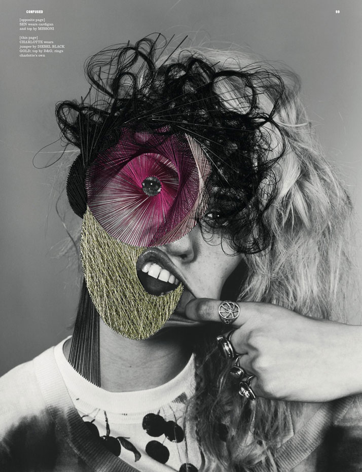
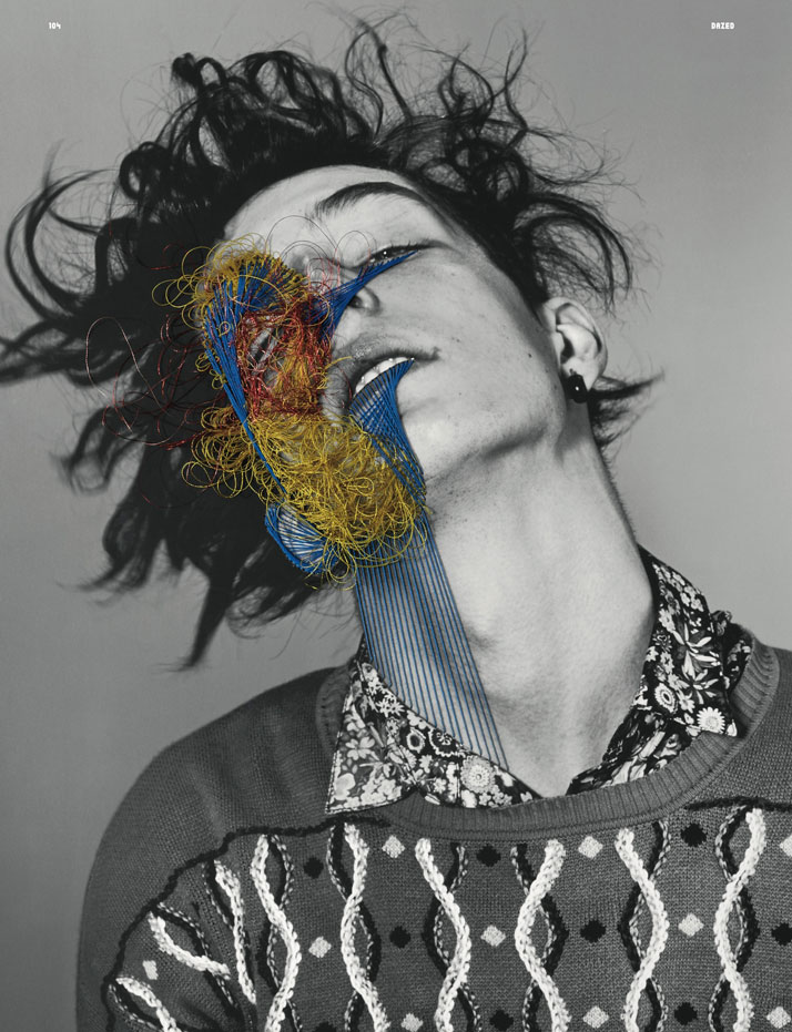
 Out of all of Maurizios works this is my favourite for its abstract approach in developing the vintage 35mm picture and the contrast between the straight silky blue lines and the aggressive messy entangled yellow and red lines. The way this piece uses its primary colours is rather interesting with the warmer colours being the messy abstract lines and the cooler blue being the strictly straight angular lines, almost suggesting two sides to this image. Telling a story through contrast of line colour and compositions  having and over all crazy eye catching appearance. This piece particularly has a very up-cycled feel to me through the contrast of the black and white picture and the colourful abstract lines represented by the thread which makes this piece strong and work very well.

Quote :    "DD: Did you come across any challenges in the project?
Maurizio Anzeri: Every project is a challenge, it was good to draw with threads in a different way and mixing it with embroidery.
DD: When you start a piece do you improvise? Or do you know exactly what you’re going to do?
Maurizio Anzeri: I never know what I am going to do, Once a 'conversation' starts with the piece/photo/face, things starts to happen.
DD: What do you want people to take from your work?

Maurizio Anzeri: EVERYTHING, in one moment!"
From reading this interview from Dazed and Confused with Maurizio I can now see the obstacles I may face when trying to re create a similar technique and how I might approach further development to my initial mixed media developments.
After looking at all of Maurizios work I can see the main trait I will take forward is his trade mark technique, working into vintage pictures with threads to represent line and the way this transcends into an emotive outcome through colour and and composition. For example I could take this technique forward as I develop into my observations and again further develop using a range of mixed media's and threads onto a piece of pre used material that can be up-cycled. 

Sunday, 27 April 2014

Hepworth Gallery/ YSP

Today I visited the Hepworth gallery and Yorkshire sculpture park I collated a mass of primary information and observations (photography and sketches).
In visiting the Hepworth I was able to further widen my artist Intel, in doing so I was inspired by a lot of artists work (Barbra Hepworth, Magda Cardell, Dennis Oppenheim and Von Rydingsvard) which I was able to capture on a camera and in my hand rendered book using my mark making skills and range of dry media to produce a plethora of drawings and sketches using techniques such as; blind drawing, timed drawing, collage, charcoal, oil pastels, coloured pencil, Biro, continuous line, negative space drawing and painting. Below you can see a selection of the strongest observations from both galleries that I will move on to develop:


After much analysis of each drawing and technique used I would like to take forward my charcoal and bread drawing of a sculpture in the Hepworth, I have chosen this observation because I particularly loved the technique used in which captured the sculpture using tone line and texture which is simple however effective. In developing this piece I think I will looking into working on a much larger scale trying to perfect scale and tone, I will also look into starting to introduce other materials keeping the piecce fairly monotone using foils, plastics ect.
Therefore I have also decided to develop another piece which will be another piece from the Hepworth being the fine lined continuous line drawing of a tall humain sculpture, I particularly liked this piece because it had a striking resemblence of a high fashion illustration with exaggerated proportions and stance. In developing this piece I will look into using mixed medias such as working into line with sewing and adding used materials such as used clothes and plastics.  

Below you can see a contact sheet of all the strongest images taken throughout both visits:


 >
From looking over these images I would like to develop one of my images (image marked with >), in developing this picture I would like to practice a half torn and drawn into effect. Creating a hybrid of image and drawing.

Brief Analysis

In this brief ‘Sculpt’  I will be working towards the final outcome of either a body adornment piece, 3D textile piece or a collection of three textile sample pieces. The concept behind this brief is sustainability and social responsibilities (being socially aware) therefore when developing designs and ideas I  need to incorporate ethical manufactured processes and materials that could use such as up-cycling used materials and organic cloth. 
The process in which I am going to undertake will begin by visiting the Wakefield Hepworth Gallery and Yorkshire Sculpture Park to gain primary research by photographing and building up wide variety of mixed media observations based on the works that are being exhibited. I will also gain further relevant secondary research by looking online, in books and in magazines to build up a plethora of artist research. From this  I will observe and select visual information such as tone, line, shape, pattern, surface and structure in order to generate numerous ideas. From here I will then go in to further development of ideas working in a structured way following the design development cycle whilst throughout analysing my designs decisions on my blog and in my journal. When thoroughly explored, developed, analysed and evaluated I will then be ready to choose/ plan a finished outcome. 
Problems and challenges that I may need to overcome could include finding materials that work with my designs and that have been recycled or reused and how I can incorperate these pieces into a outcome that is strong. Also making sure that in sourcing, I source materials that are linking in with themes and colour schemes as with in this brief I need to use reused materials and not brand new fabrics that are unethical or socially aware. materials collected must concur with the ethical rights in that they aren’t sourced from sweatshops or places of work without health and safety, human rights or negative social and environmental impacts. This will probably involve us having to source unwanted materials from family and friends, by visiting charity shops, car boots, vintage/second hand shops and scrap yards. 
For the brief submission we will be handing in a brief analysis, reflective diary, a sketchbook, project proposal, theme board, mid project presentation, final illustration/visualisation, final written evaluation, bibliography, a minimum of 3 presentation boards and either a body adornment piece, 3D textile piece or a collection of textile sample pieces. This project must be submitted by 26th may '14

Friday, 25 April 2014

Creating Handmade Primary Observation Book

In Preperation to visiting the Yorkshire sculpture park and The Hepworth Gallery I have decided to create I have decided to create a hand rendered sketch book using a plethora of reused materials in which I can account all my first person observations from both visits.
Whilst looking for inspiration in creating my book I decided to conjure up some inspiration by looking at artists and other blogs.
Firstly I looked Into ways to bind the book together looking through other 'Pinterest'  http://www.pinterest.com/source/lilbookbinder.wordpress.com/
I particularly liked the variety of materials and techniques that can be used to create a bind of a book.
however I would like my book to be simple yet be made up of a wide variety of different material to draw onto. 
Book cover ideasShowing off some of my students’ work | Lili's Bookbinding Blog
I practiced binding my book with a number of techniques which included ; stitching, stapling, sellotaping, using wire, using clothes and using string 
After a series of trail and error I have decided to go for a simple yet effective technique using string to bind my book together (one over one under) Below you can see my final book bind.


In creating the aesthetics to my book (the book cover/ inside pages) I took inspiration from a number of sources mainly looking at Paula Steere
An artist creating her own books that are fairly scrappy with torn pages and accidental tears 
with an inability to through away pieces of paper Paula decided to use her scraps she had left to up-cycle and create a books out of these.
In creating my my book I used a number of different papers; tracing paper, cardboard, packaging, receipts and used papers
I decided to liven the cover up by spray painting  which added texture and colour and I liked the effect this made.
Overall I think the final out come of the book is strong having a distinctive up-cycled look and will be great to capture my observations in

Bruce McClean - Beyond the pose (exhibition)

Today in my build up of primary research I decided to visit Leeds' art gallery, particularly looking into Bruce Mc Cleans  - Beyond the pose exhibition. 
Work collected over a 50 year period.
Bruce Mcclean is an artist/ sculptor with an abstract flair of using mixed media and a plethora of techniques and styles to create beautiful pieces from real person sources.
An artist with all around abilities, no preference to the standard rules or composition but an artist that prides him self on the use of line, colour, shape, texture and tonal variations.


Here you can see one of Bruce Mccleans works exhibited in Leeds art gallery (name:N/A)
I particularly liked this piece  for its majestic colour scheme  using complimentary colours Yellow and blue to make certain aspects of this painting stand out for example its De stjil inspired aesthetic having a multitude of shapes infilled with complimentary colours to set a eye popping visual. With this piece being of an abstract nature it captures an environment of which is unclear having no point of reference, made with oil on canvas this piece has areas with beautiful translucent qualities for example the oblong with the thin white layer of paint  is allowing the light to reach the cool violet reflecting the colour, which creature a very erratic textured composition which works very will on this piece.  
I think the use of geometric shapes in this piece adds to the nonsensical qualities of this painting again contrasting with the block coloured shapes and the line drawn shapes.
overall I think this piece by Bruce is strong and fits in well with the rest of his collection and I could take forward the techniques in which he has used to create a simple yet effective piece.

I particularly like this piece by Bruce McClean again using oil paints to portray an abstract environment using geometric shapes and hints towards the human form.
However this piece first caught my eye for being more intricate with a contrast in areas of precision opposed to area which are almost unfinished and still quite sketchy which sets an ambivalent tone towards this piece.
Personally I love the mainly analogous colour scheme running throughout the piece used in a subtle way to create a cool feel with light blues through to cold pinks in contrast to this calm outset the painting has a few cleverly place hints of yellow creating a focal point due to the visual effect yellow and violet make, which is very effective.  

I really enjoy this aggregation of sculptures designed and made by Bruce McClean 
with its well thought out array of colours.
Standing out the most to me is the fact that this piece as a whole is purely successful because of it composition and the way each individual piece is placed opposed to the other, aesthetically being successful due to the obtuse shapes, lines and colours coming together as one.    

Again you can see another on of Bruces pieces, I decided to look closely into this piece due to its variation to other similar pieces using the same techniques, this piece uses a wide range of colours using a multitude of complementary colours producing a very busy again abstract piece which tells a story and emoting a number of feelings with one side being rather cold and vibrant and the other side being very mellow, producing a very vintage worn out look on one side and a new clean look on the other.
Throughout looking over Bruce Mccleans work although the multitude of materials and techniques he practices with he always follows the same distinction end to end in each collection which is something I can take forward into my next project.